A flexible, responsive, student registration system designed from the ground up to get students into the right classes quickly and efficiently.
Fast Facts
Role
Sketches, wireframes, high-fidelity comps, functional prototype, user testing, HTML, CSS
Tools
Pen & napkin, Sketch App, InVision, Visual Studio Code, Adobe Creative Suite
Timeframe
Initial app design was completed in 2016. Refinement and feature additions took place from 2016-2020
User Profiles
01
Students
Interviews were done with students at development partner schools to investigate problems with existing course scheduling apps and areas for improvement.
Mobile friendliness is essential
Use app once per semester
Finding the right courses is a challenge
02
Advisors
Limited interviews were done with advisors to investigate how they use a course search tool to assist their advisees.
Large-screen users
Want quick access to a lot of data
Creative course recommendations
03
Registrars
The university registrar is the primary purchasing authority. Development partner registrars were closely involved in the design and prototyping process to ensure the product would meet their goals.
Good student experience
Enable discovery of "fringe" courses
Multiple carts to save courses for future
Accessibility is essential
Problems
Throughout the user interview process and meetings with the registrars (who were the purchasing authority for this product) we identified a few challenges that needed to be addressed outside of the core features.
Mobile users
Student users of this app will be using it primarily on their phones and other handheld devices but we need a robust large-screen experience for advisors. Leepfrog had limited experience creating products for the student side and responsive web development was limited to static catalogs.
Transient audience
Users only interact with the application sporadically so the interface needs to be intuitive and easy to pick up at a basic level.
Lots of data
In addition to course data, we also need to expose section-level data and scheduling information… all on a small screen.
Do something new
Course scheduling is considered a "solved problem" and the client wanted something new and original. We needed some features that would make this product better than the established players in the market.
Process
Sketches
The design started to take shape during a dinner with the CEO of Leepfrog at a steakhouse in Iowa City. I sketched the initial design of what would become the "sliding panes" approach on a paper bar napkin. Initial sketching and design focused on mobile view for a "mobile first" approach.
Wireframes
I took the sketches back to the office the next day and worked up the first round of wireframes based on the sketches. We then iterated on the data presentation with the development partner institutions and performed an initial set of user tests on a wireframe prototype.
Hi-Fi
When the wireframes were solid, I moved on to hi-fidelity mocks of a few screens. With a little help from one of our engineers, we mocked up a working HTML/CSS prototype that was put in front of some users at the dev partner institution for an additional set of user tests.
Build
With the overall design fleshed out, the product moved to production. Our original HTML/CSS prototype became the base of the build. During the build process, I was intimately involved in refining the design and keeping scope reasonable for an MVP. Launched on time and significantly under dev budget.
Solution
"Sliding Panes" Pattern
Data and controls are presented in discrete panels that slide in and stack from the right. This scales well across screen sizes. The app is feature complete on a phone-sized screen but on larger screens, panes are allowed to gain horizontal width (2X and 3X) and multiple panels are available on screen at one time.
Optimized Schedules
Given a slate of courses, the app is able to suggest an optimized schedule of sections of those courses. This is particularly useful at schools with multiple campuses as it will take into account course location and travel time to avoid tight windows.
Adaptive Responsive Tables
Tables of data shift their display depending on how wide their parent is. On phone-sized screens, data stacks into a view tailored to the much smaller horizontal real estate of a small screen. These tables also allow data to be presented cleanly at higher levels of browser zoom helping with accessibility.
Course Suggestions
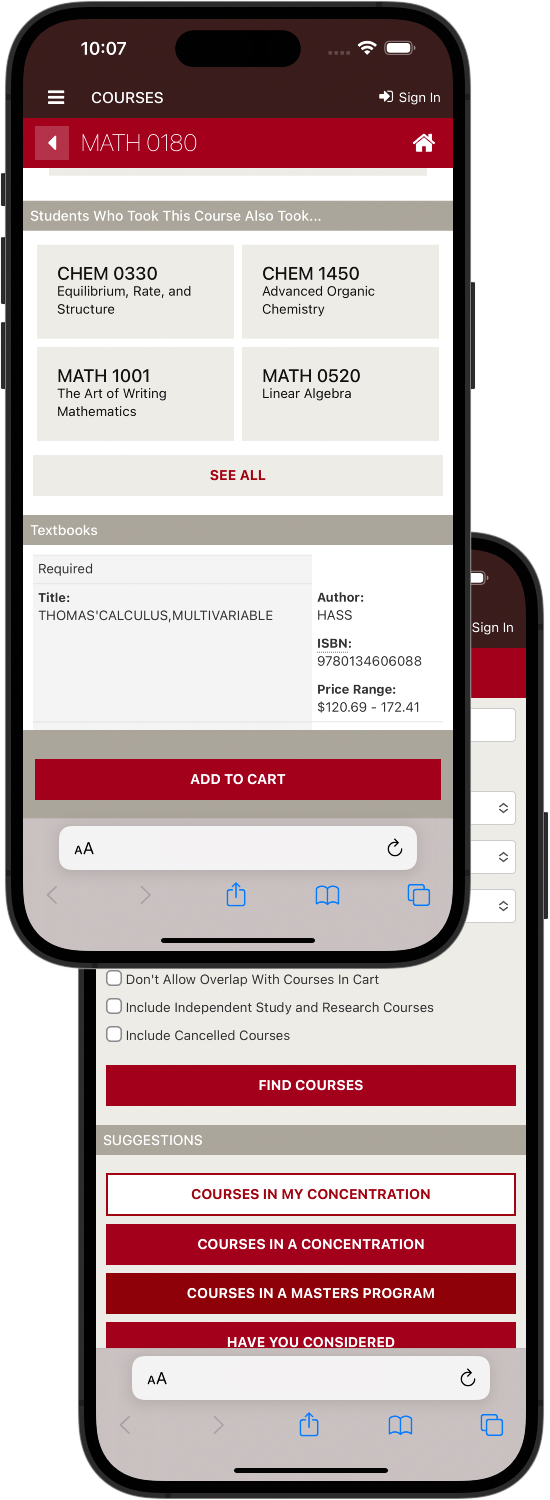
Using some machine learning and aggregated user data, the system suggests courses based on a number of factors: previous courses taken, major, similar student profiles. Once on a course detail page, the system shows demographics for the course: enrollment, breakdown of enrollment by student year, etc.
Customizable Search
Institutions have an immense amount of control over the data that can be searched and the display of that data. Search also intelligently adapts to student profile.
Other Nifty Stuff
Visualizing entry vs. exit major. Mobile-responsive calendar view.
"This product has transformed the way our students and advisors discover and select course offerings. Having a fully personalized search and course recommendation engine this robust is in alignment with current user behaviors and expectations that students have become accustomed to."
"It helped us bridge the gap between information and informed student decision-making."
Results
Easier. Simpler. Faster. Mission accomplished.
Post-launch usability tests showed an increase in time to complete common registration tasks, accuracy of search results, and overall satisfaction with the registration process. One development partner hoped to use the tool to increase early registrations and saw an 18% increase in early registration participation after deploying the app. Another institution saw a dramatic decrease in the need for training their advisors and students on the registration process when they moved to the application.
Comments from students, advising staff, and others involved with the registration process was overwhelmingly positive.
18%
rise in early registrations
Thousands
of happy students
98%
participation
Want to learn More?
I ship software that's usable, accessible, and delights. I'd love to talk with you about how I can bring my particular set of skills to solve your problems.